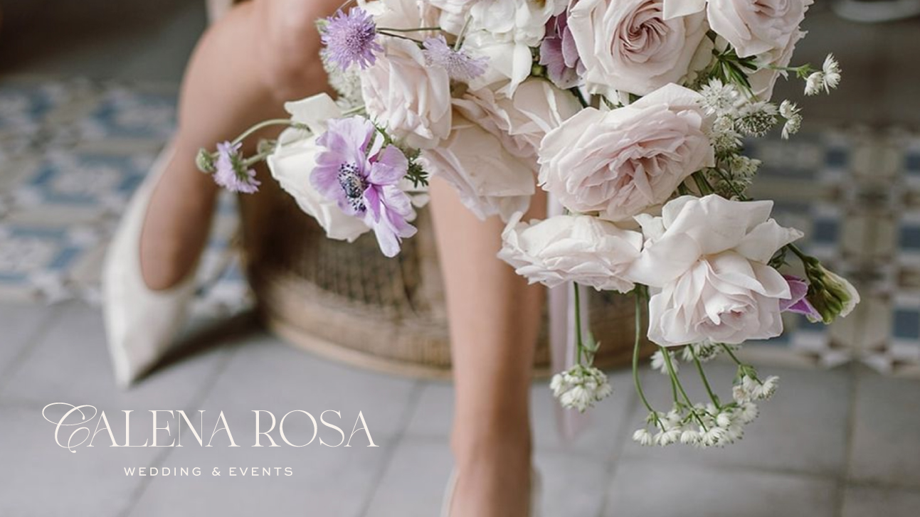
Calena Rosa – Weddings and Events
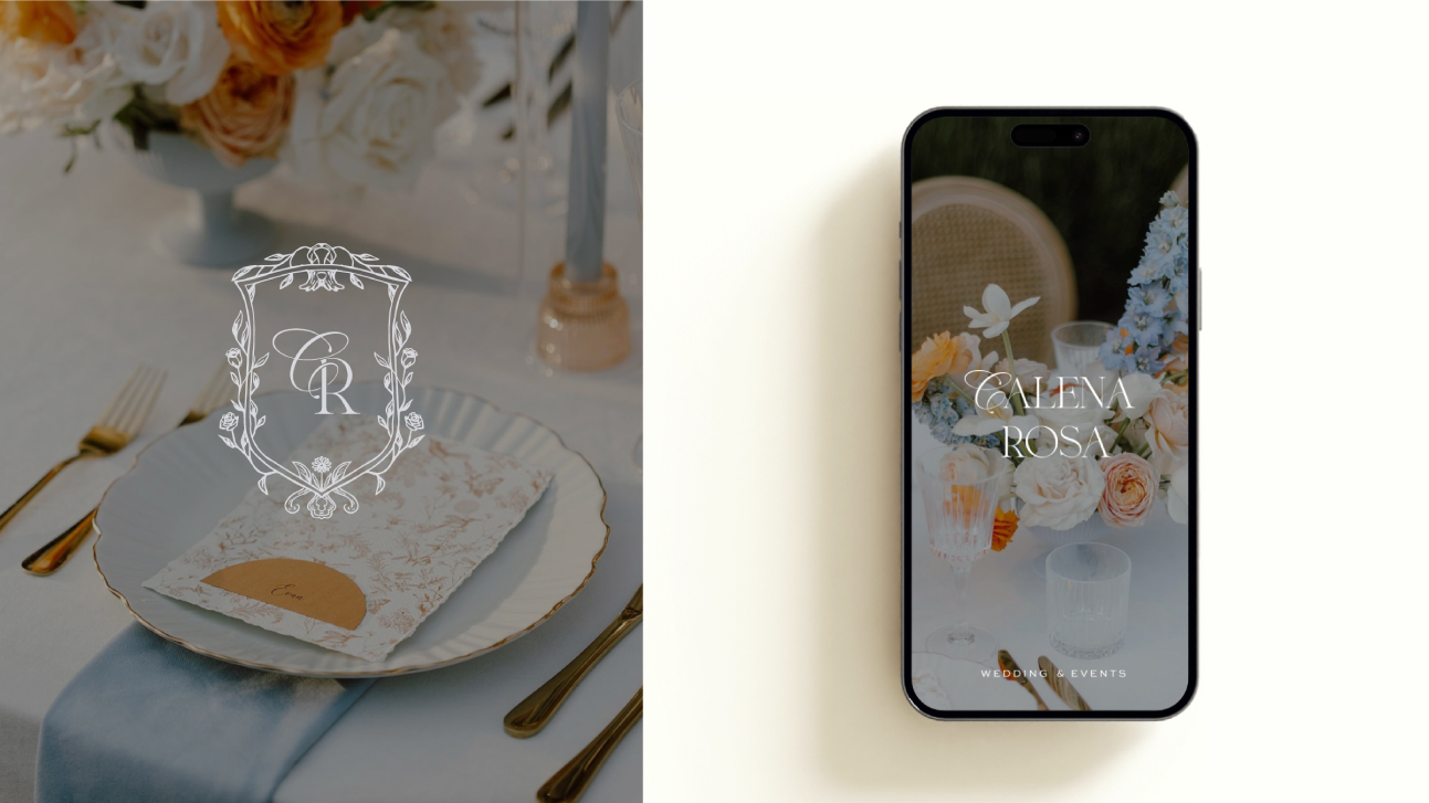
This design carries a deeply personal and symbolic meaning, weaving together elements that reflect the owner’s identity and values. The name “Calena” is inspired by the marigold flower (Calendula), which connects to the owner’s name, Nevena, symbolizing warmth, creativity, and vitality. The second part of the name, “Lena,” honors her daughter, adding a touch of familial intimacy and legacy. Lastly, “Rosa” is derived from the family name Ružić, evoking the timeless elegance of a rose and symbolizing love, beauty, and strength.
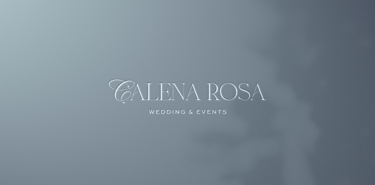
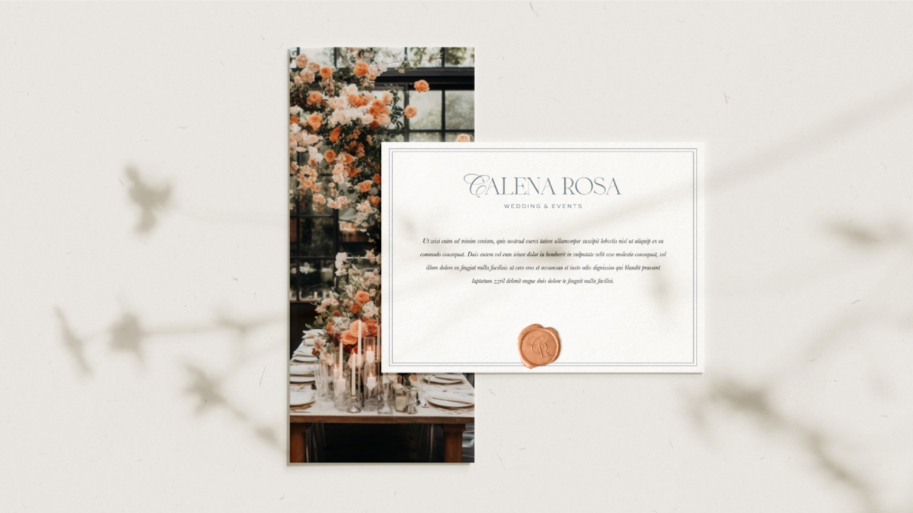
The brand harmonizes elegant serif typography with a bespoke illustration of intertwined flowers, encapsulating the beauty of both marigolds and roses. These floral motifs are intricately designed to symbolize growth, connection, and natural grace, resonating with the brand’s focus on creating meaningful and beautiful arrangements.
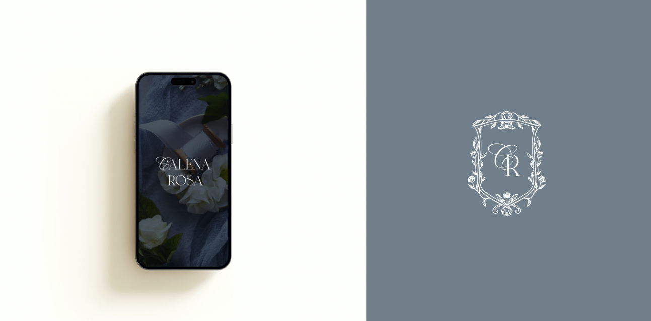
At the heart of the visual identity lies the CR monogram, where C is rendered in a graceful script font, lending a personal and artistic touch, while R is balanced and structured, representing stability and professionalism. This interplay between fluidity and form embodies the brand’s dual essence: a personal story told through artistic design.